Designing for Music Educators
Context
Designing for music teachers
Meludia is a musical learning application based on active listening, used by teachers with their students in class and as homework. These teachers (conservatories, music schools, private lessons) had no tool to track the progress of their classes of 10 to 15 students. They managed their tracking manually via Excel, without precise visibility into what each student was struggling with. Mission: design a dashboard allowing teachers to quickly identify difficulties and adapt their teaching.
The challenge
Making invisible progress visible
Musical learning through listening is inherently abstract and hard to measure. Teachers tracked their students manually via Excel each week, but had no visibility into what was actually causing problems: is it rhythm? Melody? Harmony? Which specific exercises are blocking the student? Without this granularity, it's impossible to adapt teaching effectively.
The key insight discovered during interviews with about fifteen teachers (conservatories, private schools, individual tutors): knowing precisely what a student is struggling with allows them to progress much faster. But this information was buried in exercise data that teachers didn't have time to analyze.
The challenge was to make this progress visible and actionable without reducing it to simplistic metrics. How do you visualize abstract musical concepts in a comprehensible way? How do you allow teachers to quickly scan a class of 10–15 students and identify where each one is stuck to recommend the right exercises?
My role
Product Designer
I designed the teacher dashboard end-to-end over approximately 1 year, as the sole designer on the project. My role combined understanding pedagogical needs and translating complex learning data into actionable interfaces.
01 Teacher research About fifteen interviews with teachers of varied profiles (conservatories, music schools, private tutors) to understand how they track their students, what information is essential to them, and how they adapt their teaching.
02 Defining relevant metrics Collaboration with the pedagogical and data team to identify musical progress indicators by dimension (melody, rhythm, harmony, spatialization, density, stable/unstable) and by exercise, without creating alert overload.
03 View and visualization design Design of a two-level navigation system (class view → student view) with a unique visualization of musical dimensions as an organic graph, allowing teachers to understand at a glance where a student excels and where they're stuck.
04 Iterative user testing Two testing sessions in conservatories with approximately 15 teachers to validate comprehension of the visualizations and information hierarchy. Critical discovery: too much gamification undermined the educational aspect, with students focusing on scores rather than learning.
05 Progressive rollout and iterations Beta deployment then full launch with 4-week sprints. Addition of supplementary statistics (exercise-level details, average time per attempt) following enthusiastic field feedback from teachers.
Design decisions
Visualizing musical progress
Overview then detail, without alerts
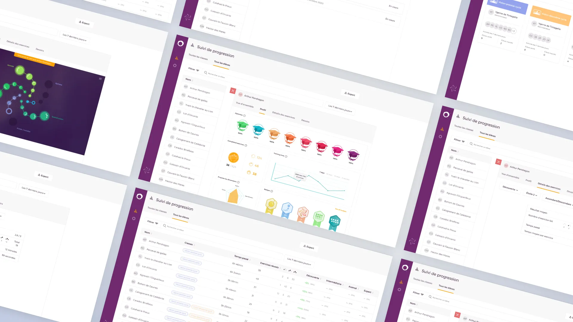
The dashboard is organized in two levels: an "All classes" or "All students" view allowing quick scanning of who is progressing and who is stuck, using a table with time spent, completed exercises, and progress by difficulty level (Discovery, Intermediate, Advanced, Expert). Class badges (colored cycles) and green percentages (+10%, +14%) immediately identify active students and their momentum.
Then, clicking on a student opens their detailed profile with diplomas earned, overall progress (38/625 exercises), play time evolution over time (7 days, 30 days, 90 days, 6 months), and most importantly the breakdown by musical dimension.
Deliberate choice: no automatic alerts. Teachers did not want to be overwhelmed with notifications. Their role is to analyze and guide with their pedagogical expertise, not to react to algorithms. The dashboard conveys information clearly and scannably — the teacher decides what action to take.
Unique visualization of musical dimensions
Rather than a traditional spider web radar, we created an organic graph visualization where each musical dimension (Melody, Rhythm, Spatialization, Density, Stable/Unstable) is represented by connected nodes on an immersive background. The size and color of the bubbles indicate the level of mastery; connections between nodes suggest relationships between skills.
This visual representation, more organic and musical than a conventional chart, allows teachers to understand a student's strengths and weaknesses at a glance in a more intuitive way than a table of numbers. The visual approach also reinforces the creative and artistic nature of musical learning, far from a simple score spreadsheet.
As a complement, a classic radar chart (in yellow) is available in the Profile tab for those who prefer that representation, offering two reading modes.
Granularity down to exercise-level detail
The most important metric displayed first: progress in exercises (38/625), giving essential information about the current level. But the dashboard allows drilling down to the detail: an "Exercise details" tab with filters by dimension (Discovery, Star 2, etc.), average result (2.6/3), distribution of attempts (bar chart showing 0, 2, 5, 12 attempts), total time spent, and average time per exercise (59 seconds).
This granularity allows a teacher to say precisely: "This student is stuck on Star 2 exercises in Melody, with an average of 59 seconds per exercise and a result of 2.6/3. We need to recommend targeted exercises for this skill."
Manual recommendations and assigned homework
Rather than automatically generating exercise recommendations, the dashboard offers a "Homework" tab where teachers can manually assign specific modules or skills after analyzing the difficulties. For example: "Discovery module - All stars - All branches" or "Skill: Stable/Unstable".
Assigned homework displays its status ("In progress") and dates, allowing teachers to track whether the student is working on what was recommended. This approach respects the pedagogical expertise of teachers and gives them full control over the guidance.
Dashboard overview
Impact
A tool adopted and praised
- Adoption by approximately 50% of teacher users of the application, with very enthusiastic initial feedback addressing a major field demand
- Tracking time reduced from 2h to 30min per week per class by centralizing progress information instead of manually maintaining Excel files
- Precise identification of difficulties by musical dimension through the organic graph visualization and radar, allowing teachers to see at a glance where a student is stuck
- Granularity down to exercise-level detail with average time per attempt, average result, and attempt distribution enabling highly targeted pedagogy
- Positive impact on student retention through better pedagogical support adapted to each student's difficulties
Reflections
Key takeaways
Making the invisible visible without oversimplifying it
Musical progress is complex and multidimensional. The challenge was to make it understandable without reducing it to a simple score. Teachers need granularity to adapt their teaching (which musical dimension? which exercise?), but also clarity to act quickly. The organic graph visualization achieved this balance: immediate artistic overview, detail accessible with one click.
Teachers have pedagogical expertise that I don't have. My role was not to decide what is relevant, but to translate their needs into functional interfaces. The 15 initial interviews and iterative testing in conservatories were essential. The insight "knowing precisely what a student is struggling with allows them to progress much faster" came from them, not from me.
Gamification can harm learning
User testing revealed that an overly gamified interface diverted students' attention from learning toward scores. This discovery influenced the entire design: prioritizing pedagogical clarity over superficial engagement. A good educational tool is not necessarily a game.