Streamlining Musical Learning Flows
Context
Improving an existing musical training application
Meludia is a web-based ear training application that develops musical perception across different dimensions: melody, harmony, rhythm, density, and spatialization. When I joined in 2017, the application already existed with functional flows, but it suffered from significant drop-offs at key stages. Mission: identify friction points and streamline the flows to improve user retention.
The challenge
Reducing friction without diluting the app's originality
Meludia's interface is highly original: the star, the musical dimensions, the non-linear progression. This originality is a strength, but it also created confusion. Users arrived at the first screen without understanding where to go or how the app worked. Account creation was tedious, and once inside the app, switching exercises required fully exiting the current screen, breaking the training flow.
The challenge was to reduce this friction without oversimplifying or losing what makes Meludia's identity. How to guide without imposing? How to streamline navigation without making everything linear?
My role
UI/UX Designer
I joined Meludia in July 2017 as the sole designer on the team. My role covered improving the existing web application, in collaboration with the PO and dev team (1-month sprints).
01 Research and friction identification Analysis of analytics data to identify drop-off points. About ten user tests on onboarding and navigation between exercises to understand real blockers.
02 Onboarding redesign Design of a step-by-step guided tutorial, skippable, that explains how the app works through practice rather than static explanation screens.
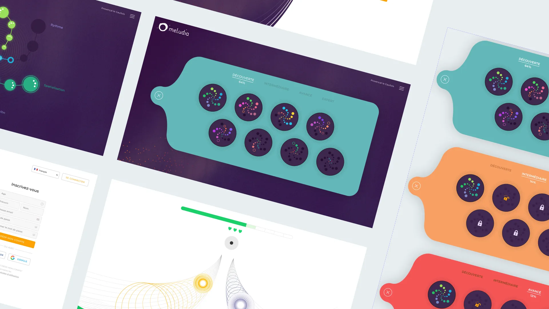
03 Improved navigation between exercises Design of an overlay system allowing users to switch dimensions and stars without leaving the exercise screen, maintaining the training flow.
04 Gamification elements added Integration of progression animations (rising points, 3/3 completion, score bar), badges, and visual feedback to make progress more tangible.
05 Testing and iterations Regular user testing to validate improvements. Progressive rollout over 6 months (2 months onboarding, 4 months navigation).
Design decisions
Guide without imposing, streamline without simplifying
Skippable guided tutorial vs static explanation
The old onboarding left users on the first screen without understanding where to go. The temptation was to create a series of explanation screens, but testing showed nobody read them. The solution: a guided tutorial that walks users through their first steps, exercise by exercise, by actually having them complete their first exercises. Skippable to avoid frustrating those who prefer to explore on their own.
This tutorial paradoxically added more steps than before, but the completion rate rose to 95% because users finally understood how the app works. The time to reach the first exercise after an email invitation dropped to around 15 seconds.
Overlay navigation vs full exit
Before, switching musical dimension or star required fully exiting the current exercise, going back to the selection screen, choosing, and restarting. This friction broke the training flow and discouraged exploration.
The solution: an overlay menu accessible from the exercise screen allowing users to quickly switch dimension (melody, rhythm, harmony, etc.) and star (difficulty level) without ever leaving the interface. Exercises in the same branch now chain naturally, and users can pivot to another dimension in one click.
The trade-off: prioritizing flow continuity over information exhaustiveness. Less explanation, more action.
Measured gamification
Adding end-of-exercise animations (rising points, 3/3 feedback, progressive score bar) and badges made progress more tangible. These gamification elements were calibrated to reward practice without creating superficial addiction. The 20% increase in average session duration shows that users stay engaged longer.
App overview
Streamlined flows, stronger engagement
- 35% reduction in onboarding drop-off through the guided tutorial, helping users quickly understand how the app works
- 95% tutorial completion rate versus a very low rate with the old static onboarding, proving the effectiveness of the guided approach
- Streamlined navigation between exercises with the overlay system eliminating back-and-forth and maintaining the training flow
- 20% increase in average session duration through gamification elements (animations, badges, visual feedback)
- Time to first exercise reduced to approximately 15 seconds after email invitation
Reflections
Key takeaways
Originality must not sacrifice comprehension
Meludia's interface is unique, and that's a strength. But originality without guidance creates confusion. The guided tutorial preserved that originality while giving users the tools to understand it. Sometimes, adding more steps improves the experience if each step has purpose.
Flow takes priority over exhaustiveness
The overlay navigation removed a major friction point by sacrificing some information space. You can't show everything at once. The trade-off between flow and exhaustiveness almost always tilts toward flow: users prefer to move forward quickly over understanding exhaustively.
Gamification must serve learning
Score animations, badges, and visual feedback are not merely decorative. They make progress tangible and sustain motivation. But they must remain calibrated: reward musical practice, not clicks. The 20% increase in session duration shows it works without undermining the pedagogy.